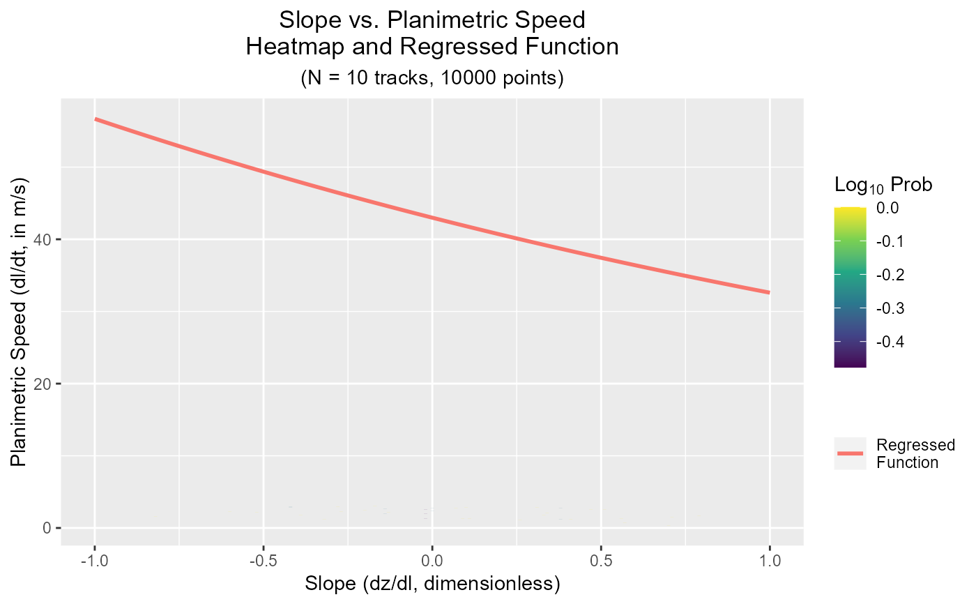
Plot GPS Velocities
plotVelocity.RdPlot the log-probability of the observed velocity data points versus the regressed nonlinear quantile regression
plotVelocity(
  velocity,
  v_lim = 3,
  v_min = 0,
  slope_lim = 1,
  bins = 100,
  x.bins = bins,
  y.bins = bins
)
Arguments
- velocity
The list output to
getVelocity.- v_lim
The maximum velocities to plot (y-axis limit). Default is 3 m/s.
- v_min
The minimum velocities to plot (y-axis limit). Default is 0.
- slope_lim
The maximum slopes to plot (x-axis limits). Default is 1.
- bins
Into how many bins are the axes divided?
- x.bins
Into how many bins are the axes divided?
- y.bins
Into how many bins are the axes divided?
Value
A ggplot object
Examples
# Note that the output results should be senseless since they
# are computed on random data

# If the data contains an 'elevation' or 'z' column
data <- data.table(x = runif(10000,10000,20000),
                   y = runif(10000,30000,40000),
                   elevation = runif(10000,0,200),
                   dt = 120,
                   ID = rep(1:10,each=1000))
velocity <- getVelocity(data = data, z = 'elevation')
plotVelocity(velocity)